
Branding: It’s Not Just a Logo
Good branding goes far beyond having a nice logo. Branding is about effective communication and a cohesive visual language that conveys who you are as a firm and how you want to be perceived.
Strong branding includes your logo, color palette, typography, photography, and overall visual tone working together to tell a clear story about your law firm. When done well, it creates consistency, credibility, and recognition across every touchpoint.
Need help turning your legal marketing to-do list into reality? We can help with that! Just drop us a line. Muse Communications was named one of Texas’ best legal public relations firms by the readers of Texas Lawyer. And if you’d like to get our legal marketing tips delivered straight to your inbox, sign up for our newsletter.
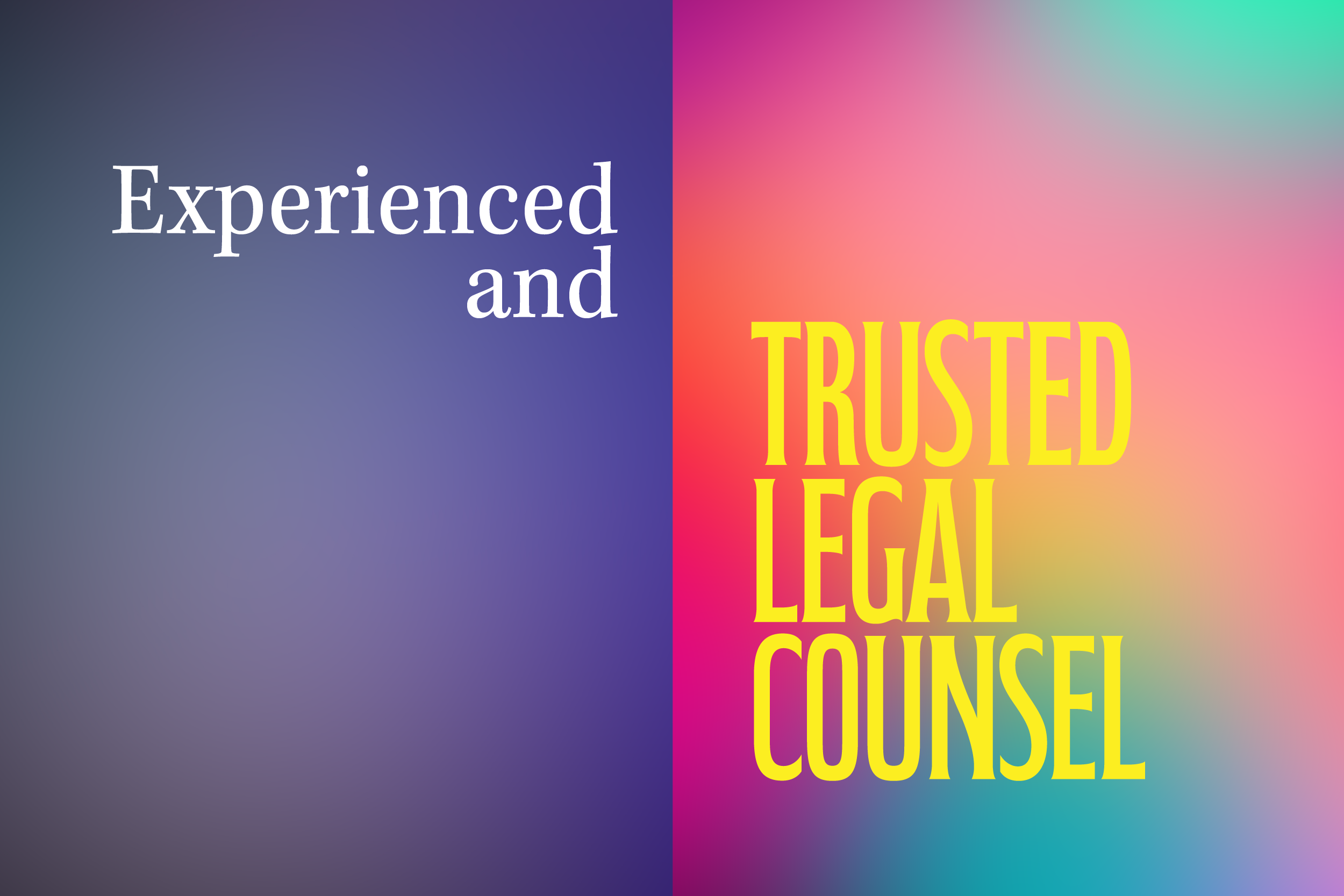
The first thing people think of when they hear the word “branding” is a logo. Logos can take many forms. Some are purely typographic, like Coca-Cola or IBM, where carefully crafted letters become iconic on their own. Others rely on graphic symbols that develop their own identity, like the Nike swoosh or Starbucks mermaid.
Either way, a strong logo helps establish your firm’s personality, whether that’s corporate and traditional or approachable and modern.
But branding incorporates far more than a stylized name or a memorable image.
Color communicates before words
Color is one of the most powerful tools in branding. It shapes perception instantly.
Imagine McDonald’s golden arches in bubblegum pink. It simply wouldn’t communicate the same thing as that familiar bright yellow “M” you spot from the highway, signaling salty fries and an ice-cold Coke ahead.
There’s real psychology behind this.
Fast-food brands rely heavily on red and yellow because, together, they communicate speed and urgency. Bright yellow is also one of the most visible colors in daylight, making those arches easy to spot from a distance.
Blue, on the other hand, is often associated with calm, trust, and stability. That’s why so many professional brands, including law firms, use blue to reinforce credibility and reassurance.
No color is inherently good or bad. But every color communicates something.
Typography matters more than you think
Fonts (also called typefaces) are another essential part of branding. They don’t just appear in your logo, but across your website, ads, headlines, email newsletters, letterhead, and internal communications.
Serif* fonts typically feel more traditional and established. Sans-serif fonts often feel more contemporary and clean. Of course, there are exceptions, but typography always sends a signal about your firm’s personality. (Serifs are the small strokes on individual letters. Serif fonts have those strokes, sans serif fonts don’t.)
Consistency here builds trust.
Photography sets expectations
Beyond logos, colors, and fonts, photography plays a major role in branding.
Attorney headshots should be consistent in style and tone. Are you presenting a suit-and-tie corporate image with subtle smiles? Or a more relaxed, button-down approach with warm, open expressions?
A simple photography wish list from designers: update headshots every couple of years. People change. You don’t want clients expecting a 30-year-old in a suit and tie and instead meeting a laid-back forty-something in rolled sleeves. Still highly capable, just visually unexpected. That momentary disconnect matters.
Whatever direction you choose, it should align with who you actually are.
The same goes for photography used on websites, LinkedIn headers, newsletters, and advertising. A cohesive visual style helps clients understand what they can expect before they ever walk through your door.
We live in a highly visual digital world. Investing in professional photography with good lighting and thoughtful composition is absolutely worth it.
Consistency is where branding becomes powerful
Once your branding and guidelines are in place, use them. Consistently. Everywhere.
That consistency is what makes your firm look polished and professional across all platforms, from your website and social media to presentations and advertisements. It also makes communication smoother and more efficient.
In the same way your attorneys’ communication in depositions or court impacts outcomes, your firm’s branding affects how potential clients, current clients, and peers in the legal community perceive you.
Good branding strengthens your message.
Taking the time to get your branding house in order enhances your firm’s image, improves communication, and supports long-term growth. It’s an investment that pays dividends.
If you’re launching a new firm or looking to refresh your firm’s look and feel, contact the branding and marketing pros at Muse Communications for a consultation.

A seasoned art director and graphic designer with over 25 years of experience crafting compelling visual identities, Sarah Brewington’s expertise spans print, digital, and physical media, bringing innovative design and intricate typography to every project.